Showing posts with label Book Travelling Thursday. Show all posts

Thursday, 27 April 2017

Book Traveling Thursdays #15 - Contemporary Reads!

Hey guys, it's Thursday which means it's time for another Book Traveling Thursday! This is a weekly meme created by Catia where we discuss book covers relating to a certain theme! I will leave the Goodreads page linked here so make sure to check it out and join in.

This weeks theme is: Because in Spring we tend to read more contemporaries, choose your favourite contemporary read.

Considering contemporaries are the genre I read the most, I had a lot of choice here. However I of course don't want to choose a book I've already talked about the covers for so I had to pick one I hadn't talked about yet. The book I'm going to be talking about today is Since You've Been Gone by Morgan Matson.

Original and favourite cover:

Since You've Been Gone

 I really like this cover, I think it's really summery and although I don't normally like people in covers, this one is done really well. It's not too bold, the colour scheme is so pretty and I like the font of the title, it's really unique. I just think it portrays what the story is about really well.


Least favourite cover:

Odkąd cię nie ma
                    (Polish)

If I saw this, I would probably think it is a sci-fi/fantasy book or something. Although I like covers with stars and the night sky on, I just don't like the way this one is done and I don't like the girl taking up half the cover either. It just doesn't make me feel summery or like this will be a fun uplifting read.

Which of these covers is your favourite and what is your favourite contemporary read? Let me know in the comments!

Thursday, 20 April 2017

Book Traveling Thursdays #14- Blue Covers

Hey guys, it's Thursday which means it's time for another Book Traveling Thursday! This is a weekly meme created by Catia where we talk about book covers relating to a certain theme or topic. If you would like some more information or to join in, I'll leave the Goodreads page linked here!

This weeks theme is: Choose a book that originally has a blue cover!

I was looking at my shelves last night and I realised that a lot of my books have blue covers, I don't know why I have so many but different shades of blue were completely taking over my shelf! Not that I'm complaining, they look so pretty! The book I decided to use for this week is A Court of Mist and Fury by Sarah J Maas. This was the best sequel to any book ever, it was so good!


Original cover:

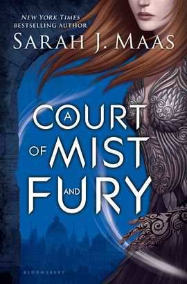
A Court of Mist and Fury (A Court of Thorns and Roses, #2)

I adore this cover, and all Sarah J Maas book covers honestly, I feel like they're so simplistic but so powerful at the same time. Feyre looks so badass in this and I love the effects of wind being done by her hair and the white wisps. The background of the city is so cute too I just really like these covers!


Favourite covers:

A Court of Mist and Fury (A Court of Thorns and Roses, #2)  Das Reich der sieben Höfe – Flammen und Finsternis (Das Reich der sieben Höfe, #2)  
                                      (German)

Obviously I've already talked about the first cover but I love how different the German cover is, and that it still fits with the story really well. The colour scheme is gorgeous and the butterflies add such a nice effect. I do think Feyre looks a little too "damsel in distress" like but the overall cover is beautiful.


Least favourite covers:

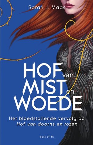
Hof van mist en woede (Hof van doorns en rozen, #2)  Corte de Névoa e Fúria (Corte de Espinhos e Rosas, #2)
       (Dutch)               (Portuguese) 

Neither of these are bad covers at all, I actually quite like them. They're just my least favourite of all of them. The dutch cover is very similar to the original except it doesn't have the detail of the city and it's quite a bit brighter than the original. I definitely prefer the original as I feel it fits better with the story. I actually quite like the Portuguese one, the colours are really bright and bold and I love the swirl patterns but again I don't think it really fits with the story.

Which cover is your favourite? Let me know in the comments!

Thursday, 13 April 2017

Book Traveling Thursday #13

Hey guys, it's Thursday which means it's time for another Book Traveling Thursday! This is a weekly meme created by Catia where we talk about book covers relating to a certain theme. If you would like some more information and to join in, I'll leave the Goodreads page linked here.

This weeks theme is: National Pet Day was a few days ago, choose a book that features your favourite pet.

My favourite pet is without a doubt is a cat. I love cats so much, they're adorable and I have a black kitten called Pendle and she's literally my everything. So I chose a book about cats that I really enjoyed when I was younger, and that's Varjak Paw by S.F.Said. Literally nobody has heard of this book and I actually really enjoyed it, it's about adventure and mischief.

Original Cover:

Varjak Paw  (Varjak Paw #1)

I think this is quite a cute cover, it's a very minimalist and simple drawing of the cat but it works really well. I don't really like the mustard colour background but other than that I think it's cute.

Favourite cover:

 Titus Tatz
     (German)

There's something about this cover that I find really appealing. The close up of the cat and how realistic it looks is really nice, and the colour scheme really works. I like how it's completely dark other than the cat's golden eye and the gold lettering. It's just really pretty.

Least favourite cover:

Варджак Лап
(Russian)

This isn't a terrible cover but I don't feel like the cream and black along the side really fits with the main image. I like the fact the cat is blue but the panel along the side completely ruins it.

Which of these is your favourite? Let me know in the comments!
Thursday, 6 April 2017

Book Traveling Thursday #12

Hey guys, it's Thursday and you all know what that means! Book Traveling Thursday is a weekly meme created by Catia where we discuss book covers relating to a certain theme. If you would like to join in the fun, or just want some more information, I'll leave the Goodreads page linked here.

This week's theme is: Spring is here! Choose a book you want to read this Spring.
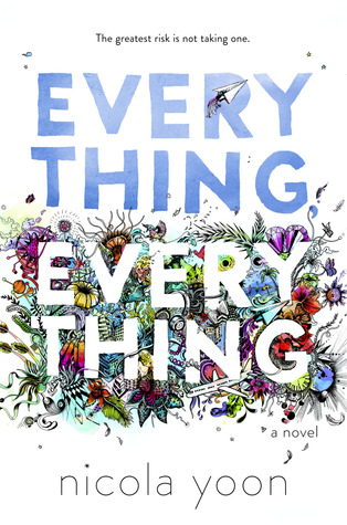
I feel like I always say this but there are honestly so many books I could have chosen for this but most of them only had one cover as they're fairly new books, or haven't been published yet and I wanted a book I had more to talk about. So in the end, I chose Everything, Everything by Nicola Yoon. I've been wanting to read this for a while as it has so many amazing reviews and I recently picked up a copy so hopefully it'll be this month that I get to read it.


Original cover: 


Everything, Everything

I absolutely adore this cover. I love how crisp and clean the white looks in contrast to the colourful mess that surrounds the letters at the bottom. All the colours blend so well together and it's full of flowers and insects and it's just really summery.


Favourite covers:


Everything, Everything       Allt eða ekkert       Everything, Everything
  (English)                           (Icelandic)                       (Indonesian)

Most of the covers I found were just the same as the original or with slight differences such as different coloured titles and I wanted to find some that were more interesting. The Indonesian one I think is even nice than the original. The scene in the background is just so beautiful and Spring like I love it. The middle one isn't that great, but the other different ones were awful. It's very simplistic and I like the colour scheme.


Least favourite covers:

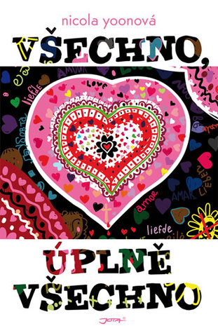
Všechno, úplně všechno  Láska stojí za všetko  Todo, Todo
    (Czech)                       (Slovak)                    (Indonesian)

All of these are just awful. The first one looks like those iron beads I used to make as a kid and it's just very childish, the colours are way too bright and awful. The middle one is just cringey and I hate people on covers anyway, it's just really childish. The last cover isn't too bad, I just think the drawn shapes are childish too and I don't like the colour scheme. Plus it looks like a rip-off cover of TFIOS.

Which of these covers are your favourite? Let me know in the comments.

Thursday, 30 March 2017

Book Traveling Thursday #11

Hey guys! It's Thursday so you know what that means. Book Traveling Thursday is a weekly meme created by Catia where we discuss book covers relating to a certain theme. If you would like to join in the fun, or just have some more information, I'll leave the Goodreads page linked here.

This weeks theme is: It's take a walk in the park day- choose a book that always relaxes you.

There are so so many books I could have chosen for this, as cute summer contemporaries are pretty much my favourite things to read and they always relax me. I wanted to choose my favourite one that I haven't already used so I chose Anna and the French Kiss by Stephanie Perkins. I love this entire series, it isn't too intense or deep, it's just the perfect uplifting happy book which is why I find it so relaxing to read. 


Original cover:


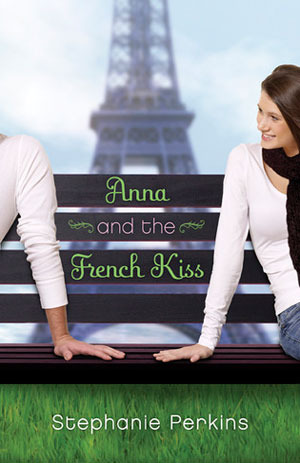
Anna and the French Kiss (Anna and the French Kiss, #1)

This is just an okay cover for me. I think I would like it a lot more if you couldn't see the girl's face- really hate people in covers. Like a lot. I love the background of the Eiffel Tower and the font of the title is super cute as well. Love the colour scheme and how bold the grass looks. It's just the girl who ruins it for me unfortunately. 


Favourite covers:

  Целувка за Ана (Целувка за Ана, #1)  Anna and the French Kiss  Ana i francuski poljubac
     (Bulgarian)                   (Indonesian)                 (Serbian)

These are some of the cutest covers I have ever seen. Really simplistic and minimal but have such a beautiful look to them. I adore the silloutes and the stars shaped as hearts and the whole night aspect of the first one, and the other two are just really upbeat and bright. I wish I owned these covers. 


Least favourite covers:

Anna e o Beijo Francês (Anna and the French Kiss, #1)  Herzklopfen auf Französisch (Anna and the French Kiss, #1)  Il primo bacio a Parigi
    (Portuguese)                    (German)                    (Italian)

The last two aren't terrible, they're just not as nice as the other one and both involve people which is why I dislike them. The last one, why is she just holding a macaroon with duck lips? Literally nothing to do with the story at all. The first one is the one I really want to talk about. It's absolutely horrible. You can't even read the text because it's all in weird different colours that blend too well with the background. The background just looks like a blur. Not a good blur that makes it look edgy and cool either, it just looks like someone can't do photography. And the girl is too posed and what is with the lighting? She doesn't even have any features. I hate it.

That's it for this week, let me know which of these is your least favourite cover! 

Thursday, 23 March 2017

Book Travelling Thursday #10

Hey guys, it's a Thursday so you know what that means! Book Travelling Thursdays is a weekly meme created by Catia where we discuss book covers relating to a certain theme. If you would like to join in the fun, or just have some more information, I'll leave the Goodreads page linked here.

This weeks theme is: International day for the Elimination of Racial Discrimination was a couple of days ago- Choose a book with a POC as a main character.

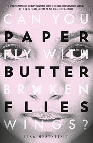
When looking back through my books to pick one for this week, I realised I really haven't read that many books with a POC as a main character, which I didn't realise and I'm quite disappointed in myself, so will definitely be making sure to read more diversely this year! I picked a book which I seem to talk about in pretty much every post these days but it's so fantastic and has a black girl as the main character and that is Paper Butterflies by Lisa Heathfield.

Shock, I know. I haven't done a BTT for this book yet though so I'm glad I've found an excuse to do one! There are only two covers for this book and both are English so I'll just be talking about those two.


Original and least favourite cover:

Paper Butterflies

You all know by now that I hate faces and people in covers of books. I don't like the fact you can barely read the writing in white and the way the title is lay out. I do like the colour scheme and the fact there is no colour on it as it shows the depth of the book.


Favourite cover:


Paper Butterflies

This to me screams, cute contemporary. This is the edition I own and I really only picked it up because I basically just look for covers that are simple and those pastel colours that all contemporaries have and pick them up. I don't think this cover shows how dark and deep the story will actually be but I still like this cover a lot more than the other one. The background colour is cute and the butterflies made of paper are so symbolic.

It's been short this week but let me know in the comments which of these covers is your favourite and if you haven't picked this book up yet, definitely do!


Thursday, 16 March 2017

Book Travelling Thursdays #9

Hey guys, it's a Thursday so you know what that means! Book Travelling Thursdays is a weekly meme created by Catia where we discuss book covers relating to a certain theme. If you would like the join in the fun, or just have some more information, I'll leave the Goodreads page linked here.

This weeks theme is: It's Freedom of Information Day-Because freedom matters, choose a controversial book.

There are a lot more controversial books around now then there used to be, because it's become more acceptable to start discussing these topics and different opinions are more talked about in society. I love controversial books as I love knowing other people's views on topics. This week, I chose Forbidden by Tabitha Suzuma!

The reason this book is controversial is because it involves the taboo topic of incest. For those who don't know, incest is sexual relationships between family members. If this is a sensitive topic for you or you are easily bothered by a work of fiction involving this subject matter, I would not recommend for you to read this book. If you are not bothered about this, definitely give it a read as it's a fantastic book.

*Disclaimer* I am in no way condoning incest or saying it is something I agree with in any way. This is purely a work of fiction and you should judge it as such, despite the sensitive subject matter.


Original cover:


Forbidden

I actually love this cover. I'll talk about it more in the next section but I love the simplicity and the barbed wire shaped to be the love heart is so symbolic of the relationship in this story and how dangerous it is.


Favourite covers:


Forbidden       Forbidden 
       (English)                           (German)

These two covers are just so perfect. They both show that the relationship is a dangerous one, with the barbed wire and the thorns shaping the love heart that surrounds the words. They're both really simple but that makes them look so beautiful and the falling rose petals in the last one are such a nice addition too.


Least favourite covers:


Forbidden   Forbudt
        (Thai)                           (Danish)

Neither of these are terrible covers but there were only a few different covers to choose from and out of them, these were my least favourite. I don't really like the holding hands and the whole colour scheme in the first one. I know it's quite a sad book at times but it just looks too gloomy. I don't like the tree on the last one, it's a weird tree. And I don't like the fact that the 'O' in the title is coloured differently to the others, it just looks weird and doesn't do a good job and portraying what the book is about. Like if I saw this, I'd think it was a historical fiction about Vikings or something like that.

Which of these is your favourite cover? Let me know in the comments below!

Thursday, 9 March 2017

Book Travelling Thursdays #8

Hey guys, it's Thursday so you know what that means! Book Travelling Thursday is a weekly meme created by Catia where we discuss book covers relating to a certain theme. If you would like to join in the fun, or just have some more information, the Goodreads page is linked here.

This week's theme is: Yesterday was International Women's Day- Choose a book with a strong female main character.

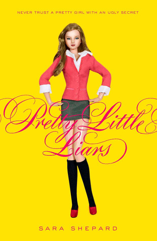
There are so many books with amazing strong female leads but as always, I wanted to pick a book that I haven't spoken about much before. So I picked a series with not one, but five strong female main characters: The Pretty Little Liars series by Sara Shepard. 

I'm sure every single on of you has heard of this series as the TV show is so famous now, and for good reason, it's probably one of my favourite shows of all time. (If I'm being honest, I prefer the show to the books.. but the books are still amazing!) Alison, Aria, Hannah, Spencer and Emily get so much crap thrown at them for like, literally 10 years and they are so strong with overcoming their fears and insecurities and they're just such deep and real characters, I love them all.


Original cover:


Pretty Little Liars (Pretty Little Liars, #1)

I like this cover. I don't love it but I don't absolutely hate it either. I think the font is super pretty and intricate, and I love how simple it is, with just the doll standing on the front posing. It represents the story well without giving too much away. My main issue with this cover is the colouring, yellow and hot pink clash so much, and I'm really not a fan of bright bold yellow anyway, it hurts my eyes and it takes up most of the cover.


Favourite covers:


   Kłamczuchy (Pretty Little Liars #1)   პატარა საყვარელი მატყუარები (Pretty Little Liars, #1)  Όμορφες μικρές ψεύτρες (Όμορφες μικρές ψεύτρες, #1)
   (Polish)                             (Georgian)                    (Greek)

I think these covers are really cute, and as I say pretty much every time, I hate people in covers when they're actual photographs but I like the cartoon-like people illustrated on the last two covers. I feel like the first cover represents the storyline so well, it's a red shoe in mud. Like if that doesn't scream PLL I don't know what does. I love the colours of all these, and the font of the text is gorgeous in all of them too. Although I do feel that the first two relate to the book a lot better than the last one, it's still a cute cover.


Least favourite covers:

Pretty Little Liars 1    Лукс и грях (Малки сладки лъжкини, #1)   Mooie meisjes hebben soms gruwelijke geheimen (Pretty Little Liars, #1)
   (Dutch)                           (Bulgarian)                   (Dutch)

Sorry Holland, obviously didn't like your covers so much this month. I don't have an awful lot to say about these honestly, it won't be a super ranty week as I don't hate the covers, they're just my least favourites. The first cover looks like a movie poster I've seen for a cheesy chick-flick but I can't remember which movie at all. It's just a bit boring though, and has a photo of half a girl's face in. The second cover just looks really childish and like I can imagine it being a cover for Angus, Thongs and Perfect Snogging. Serious question though, is the third girl along the actress who plays Cheryl Blossom in Riverdale or is that just me??? The last cover isn't really too bad, I just don't like the fact half the people aren't coloured in, it doesn't make sense.

Which of these is your favourite cover? Let me know in the comments.


Thursday, 2 March 2017

Book Travelling Thursdays #7


Hey guys, it's Thursday so you know what that means! Book Travelling Thursday is a weekly post created by Catia where we discuss book covers related to a certain theme. If you would like to join the group, or just some more information, I will leave the Goodreads page linked here.

This week's theme is: It's National Read Across America Day! Choose a book that you would recommend to everyone.


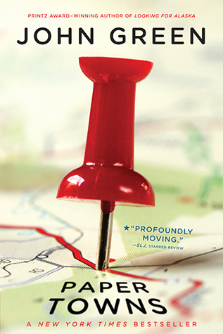
As you can probably guess, there are so so many books I could have chosen for this. I've read some amazing books recently that I would love to recommend to everyone. I have already mentioned a lot of these on Book Travelling Thursdays though and I want to make sure my answers are as varied as possible. So this week, I chose.... Paper Towns by John Green.


Obviously this is a very famous and well known book, and John Green is an incredibly talented author, though I know his work isn't for everyone. Paper Towns was my absolute favourite of his books (yes, I've read them all lol) and I know a lot of people read The Fault In Our Stars and then didn't want to read any more so I would 100% recommend giving Paper Towns a try.


Original Cover:

Paper Towns

I actually do really like this cover. It's simple but not boring. The image of the maps in the background blurring out relate well to the story and it's just bright and eye-catching. It's not my favourite cover because there are some gorgeous ones for this book that I'll discuss in a minute but I still like it. 

Favourite covers:

Бумажные Города     Ciudades de papel  Ciudades de papel
       (Russian)                       (Spanish)                      (Spanish)

There were honestly so many gorgeous covers I could've picked for this, but these three stood out to me the most. The Russian one on the left just looked really different to all the others and that's why I liked it. Most of the covers were typical contemporary style (which don't get me wrong, I love) but the fact this was different caught my eye. The city is realistic rather than 2D and I love the colour scheme. Spain did well with this book didn't they? Both editions are pastels rather than bold bright colours which is something I love in book covers, especially YA contemporaries. The last one is just my favourite cover ever, I wish I could read Spanish and have this edition it's just so cute. The text being in gold and the font and the little lit up windows on the buildings ahhhh it's pretty.


Least favourite covers:


Бумажные города     Paper towns  Margos Spuren
      (Russian)                           (English)                (German)


Now to start ranting. What is this Russian cover. I don't get it. What's anything on that cover got to do with the story of Paper Towns please someone tell me? The colours clash it's too bold and it's just weird. Who are all those people? The second one isn't as bad, it's just too dark for my liking and I don't really like the font. The third cover just looks weird, like some blue print with a few odd sketched shapes on. I don't exactly hate this one, it's just one of my least favourites.


Which of these covers is your favourite? Let me know in the comments.