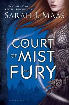
 Hey guys, it's Thursday which means it's time for another Book Traveling Thursday! This is a weekly meme created by Catia where we talk about book covers relating to a certain theme or topic. If you would like some more information or to join in, I'll leave the Goodreads page linked here!
This weeks theme is: Choose a book that originally has a blue cover!
I was looking at my shelves last night and I realised that a lot of my books have blue covers, I don't know why I have so many but different shades of blue were completely taking over my shelf! Not that I'm complaining, they look so pretty! The book I decided to use for this week is A Court of Mist and Fury by Sarah J Maas. This was the best sequel to any book ever, it was so good!
Original cover:

I adore this cover, and all Sarah J Maas book covers honestly, I feel like they're so simplistic but so powerful at the same time. Feyre looks so badass in this and I love the effects of wind being done by her hair and the white wisps. The background of the city is so cute too I just really like these covers!
Favourite covers:


(German)
Obviously I've already talked about the first cover but I love how different the German cover is, and that it still fits with the story really well. The colour scheme is gorgeous and the butterflies add such a nice effect. I do think Feyre looks a little too "damsel in distress" like but the overall cover is beautiful.
Least favourite covers:


(Dutch) (Portuguese)
Neither of these are bad covers at all, I actually quite like them. They're just my least favourite of all of them. The dutch cover is very similar to the original except it doesn't have the detail of the city and it's quite a bit brighter than the original. I definitely prefer the original as I feel it fits better with the story. I actually quite like the Portuguese one, the colours are really bright and bold and I love the swirl patterns but again I don't think it really fits with the story.
Which cover is your favourite? Let me know in the comments!

No comments:
Post a Comment