 Hey guys, it's Thursday and you all know what that means! Book Traveling Thursday is a weekly meme created by Catia where we discuss book covers relating to a certain theme. If you would like to join in the fun, or just want some more information, I'll leave the Goodreads page linked here.
This week's theme is: Spring is here! Choose a book you want to read this Spring.
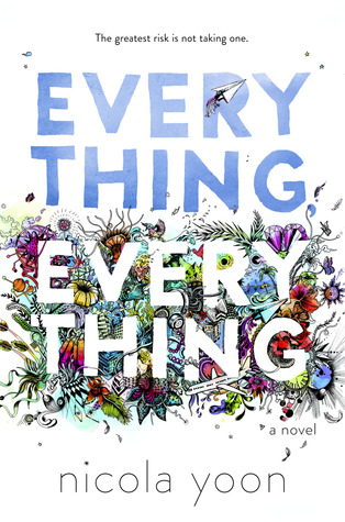
I feel like I always say this but there are honestly so many books I could have chosen for this but most of them only had one cover as they're fairly new books, or haven't been published yet and I wanted a book I had more to talk about. So in the end, I chose Everything, Everything by Nicola Yoon. I've been wanting to read this for a while as it has so many amazing reviews and I recently picked up a copy so hopefully it'll be this month that I get to read it.
Original cover:

I absolutely adore this cover. I love how crisp and clean the white looks in contrast to the colourful mess that surrounds the letters at the bottom. All the colours blend so well together and it's full of flowers and insects and it's just really summery.
Favourite covers:


(English) (Icelandic) (Indonesian)
Most of the covers I found were just the same as the original or with slight differences such as different coloured titles and I wanted to find some that were more interesting. The Indonesian one I think is even nice than the original. The scene in the background is just so beautiful and Spring like I love it. The middle one isn't that great, but the other different ones were awful. It's very simplistic and I like the colour scheme.
Least favourite covers:


(Czech) (Slovak) (Indonesian)
All of these are just awful. The first one looks like those iron beads I used to make as a kid and it's just very childish, the colours are way too bright and awful. The middle one is just cringey and I hate people on covers anyway, it's just really childish. The last cover isn't too bad, I just think the drawn shapes are childish too and I don't like the colour scheme. Plus it looks like a rip-off cover of TFIOS.
Which of these covers are your favourite? Let me know in the comments.

I want to read this book too! And the Indonesian book was my fav as well. You are so lucky to pick one with so many other covers! great post!
ReplyDeleteThank you so much love! I'm excited to get to it hopefully really soon!
Delete