

This week's theme is: It's National Read Across America Day! Choose a book that you would recommend to everyone.
As you can probably guess, there are so so many books I could have chosen for this. I've read some amazing books recently that I would love to recommend to everyone. I have already mentioned a lot of these on Book Travelling Thursdays though and I want to make sure my answers are as varied as possible. So this week, I chose.... Paper Towns by John Green.
Obviously this is a very famous and well known book, and John Green is an incredibly talented author, though I know his work isn't for everyone. Paper Towns was my absolute favourite of his books (yes, I've read them all lol) and I know a lot of people read The Fault In Our Stars and then didn't want to read any more so I would 100% recommend giving Paper Towns a try.
Original Cover:
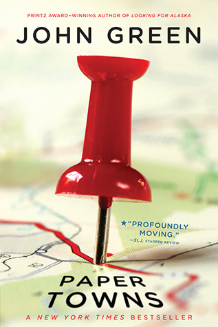
I actually do really like this cover. It's simple but not boring. The image of the maps in the background blurring out relate well to the story and it's just bright and eye-catching. It's not my favourite cover because there are some gorgeous ones for this book that I'll discuss in a minute but I still like it.
Favourite covers:


(Russian) (Spanish) (Spanish)
There were honestly so many gorgeous covers I could've picked for this, but these three stood out to me the most. The Russian one on the left just looked really different to all the others and that's why I liked it. Most of the covers were typical contemporary style (which don't get me wrong, I love) but the fact this was different caught my eye. The city is realistic rather than 2D and I love the colour scheme. Spain did well with this book didn't they? Both editions are pastels rather than bold bright colours which is something I love in book covers, especially YA contemporaries. The last one is just my favourite cover ever, I wish I could read Spanish and have this edition it's just so cute. The text being in gold and the font and the little lit up windows on the buildings ahhhh it's pretty.
Least favourite covers:


Now to start ranting. What is this Russian cover. I don't get it. What's anything on that cover got to do with the story of Paper Towns please someone tell me? The colours clash it's too bold and it's just weird. Who are all those people? The second one isn't as bad, it's just too dark for my liking and I don't really like the font. The third cover just looks weird, like some blue print with a few odd sketched shapes on. I don't exactly hate this one, it's just one of my least favourites.
Which of these covers is your favourite? Let me know in the comments.
I recommend The Girl On The Train. Film not as good. Jack Reacher novels are good too. Films also not as good. Book character is 6ft+ but Tom Cruise is 5'6"
ReplyDeleteI love the purple Spanish one you liked! This is a cool meme! Thanks for the link!
ReplyDeleteIt's so gorgeous isn't it! You're more than welcome!
Delete